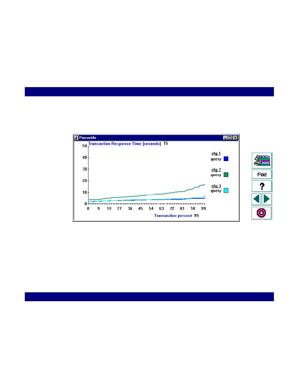
each scenario is plotted in a different color
Analyzing Test Results · Cross-Scenario Analysis
LoadRunner Controller User's Guide (Windows)
Chapter 16, page 269
6
Click OK. The Percentile graph appears. The information for each scenario is
plotted in a different color.
7
Select additional graphs from the Graphs menu.