Expected-case user community models
Because stakeholders do frequently ask for some indication of the presumed accuracy of
test results for example, what is the confidence interval for these results? another
commonsense approach must be employed.
When performance testing, the answer to that question is directly related to the accuracy
of the model tested. Since in many cases the accuracy of the model cannot be reasonably
determined until after the software is released into production, this is not a particularly
useful dependency. However, there is a way to demonstrate a confidence interval in the
results.
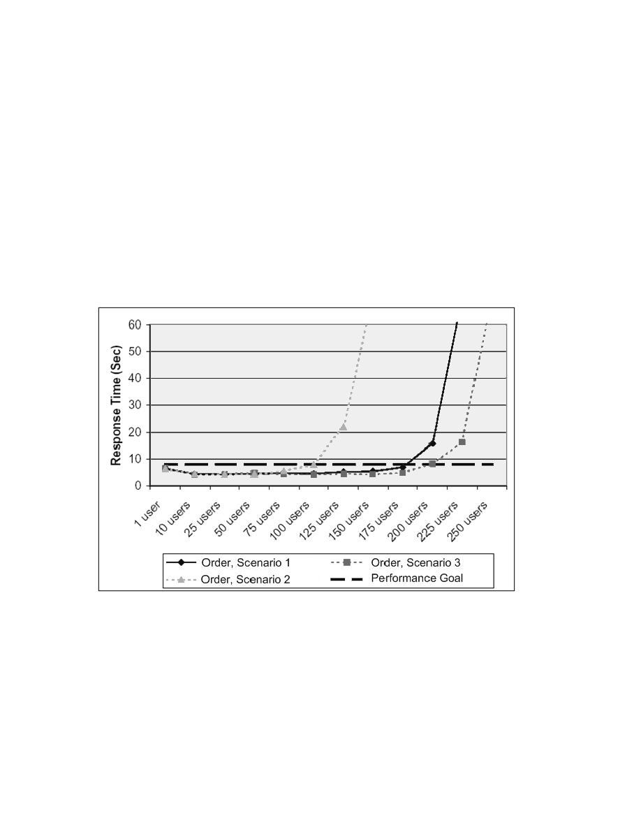
By testing a variety of scenarios, including what the team determines to be "best,"
"worst," and "expected" cases in terms of the measurements being collected, a graphical
depiction of a confidence interval can be created, similar to the one below.
Figure 15.8 Usage Models
In this graph, a dashed line represents the performance goal, and the three curves
represent the results from the worst-case (most performance-intensive), best-case (least
performance-intensive), and expected-case user community models. As one would
expect, the blue curve from the expected case falls between the best- and worst-case
curves. Observing where these curves cross the red line, one can see how many users can
access the system in each case while still meeting the stated performance goal. If the team
is 95-percent confident (by their own estimation) that the best- and worst-case user